


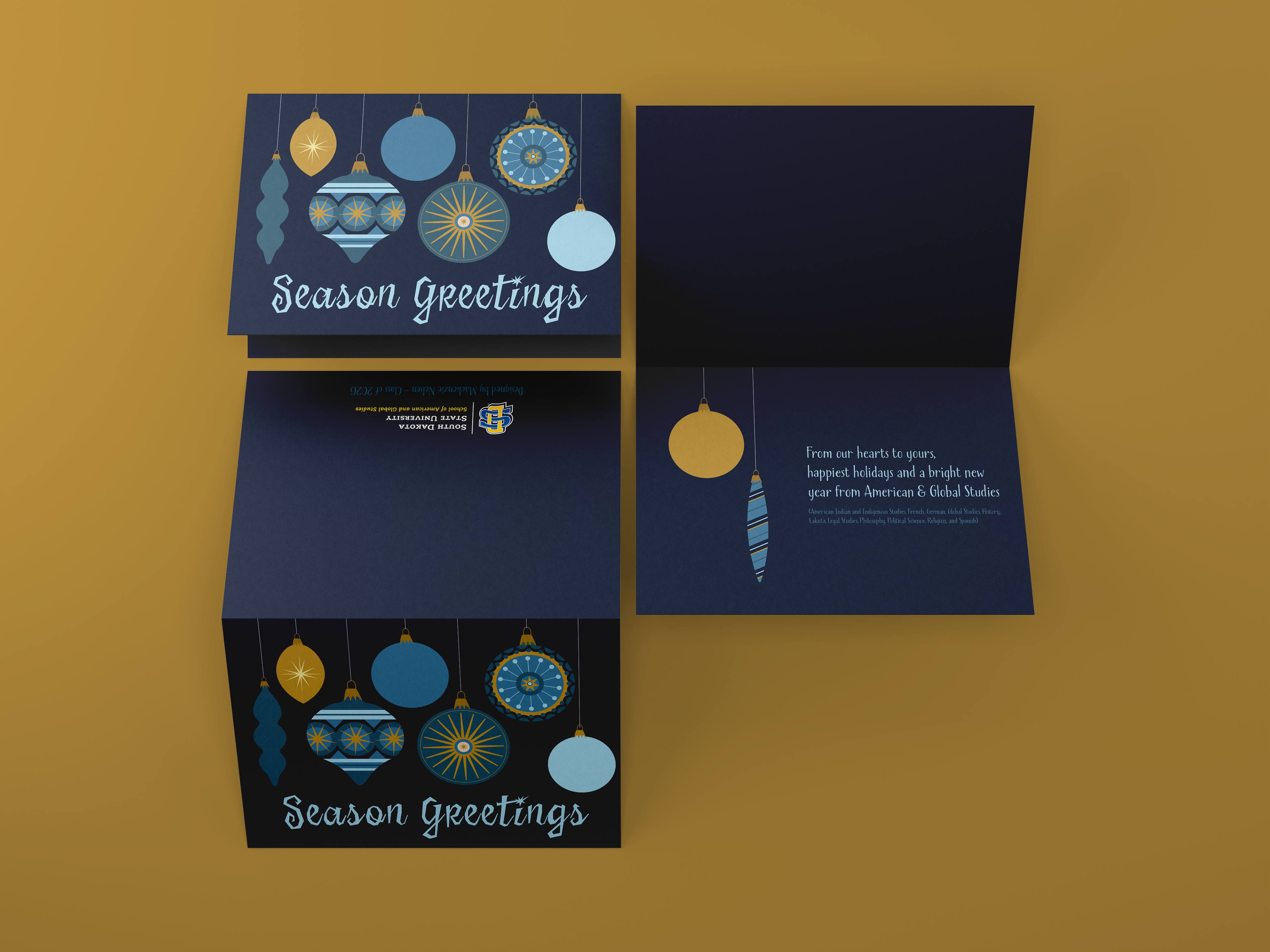
Holiday Cards Designed for the University, the School of Design, and Campus Departments. For this project, I used the South Dakota State University brand standards to determine the color palette and visual direction. When designing the university card, I wanted to reflect SDSU’s recurring message that the campus is a home. I aimed to capture both that sentiment and a sense of nostalgia. The design was inspired by President Dunn’s residence and the warm, familiar feeling of a Midwest farm in winter.
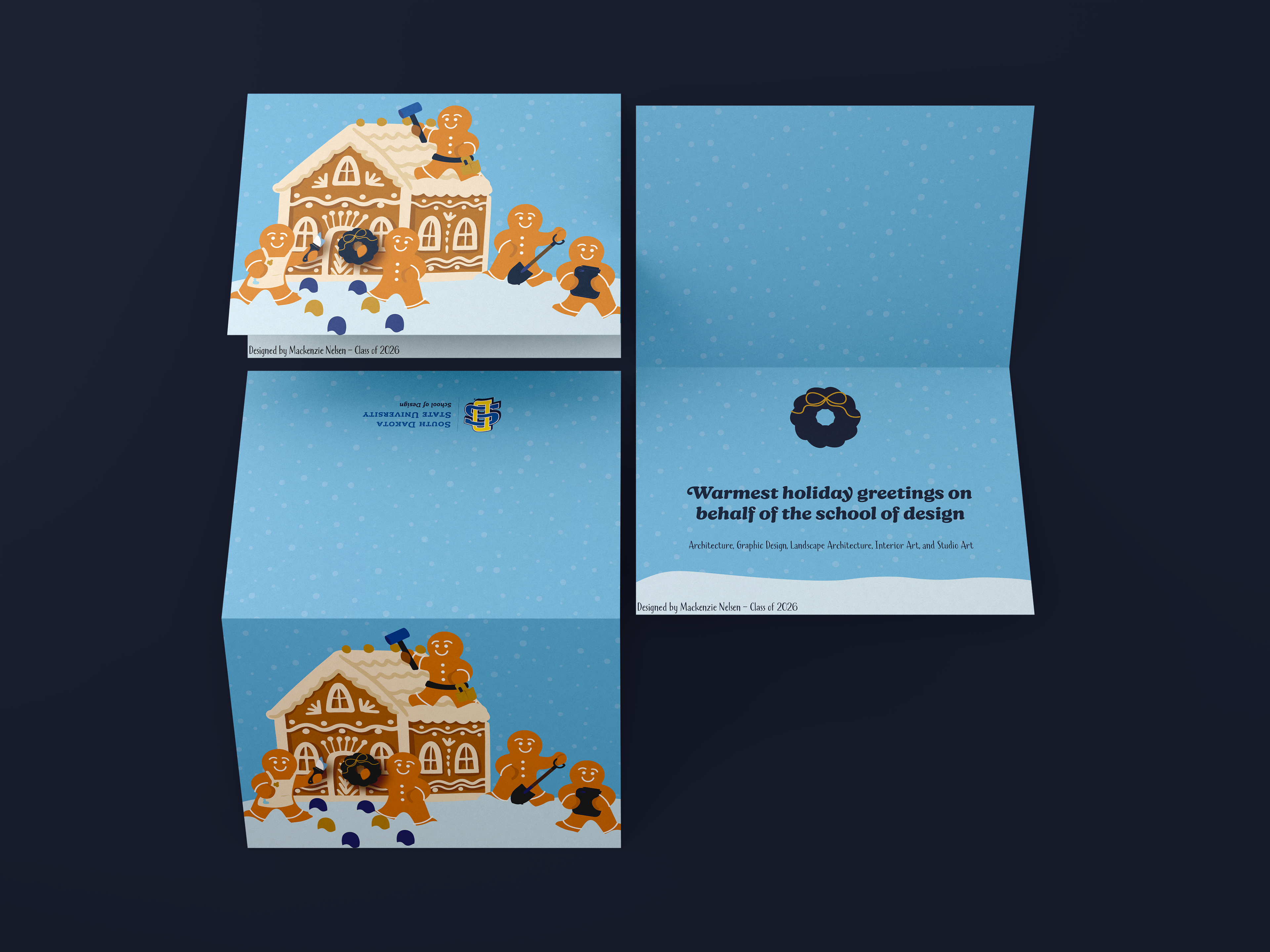
For the School of Design card, each gingerbread figure represents a different major. Together, they’re building a house—symbolizing how students from various disciplines build their futures through creativity, collaboration, and craft.
Lastly, for my department cards, I focused less on specific department elements and more on the spirit of winter activities: decorating the tree, vintage ornaments, making and sending holiday cards, and sledding.
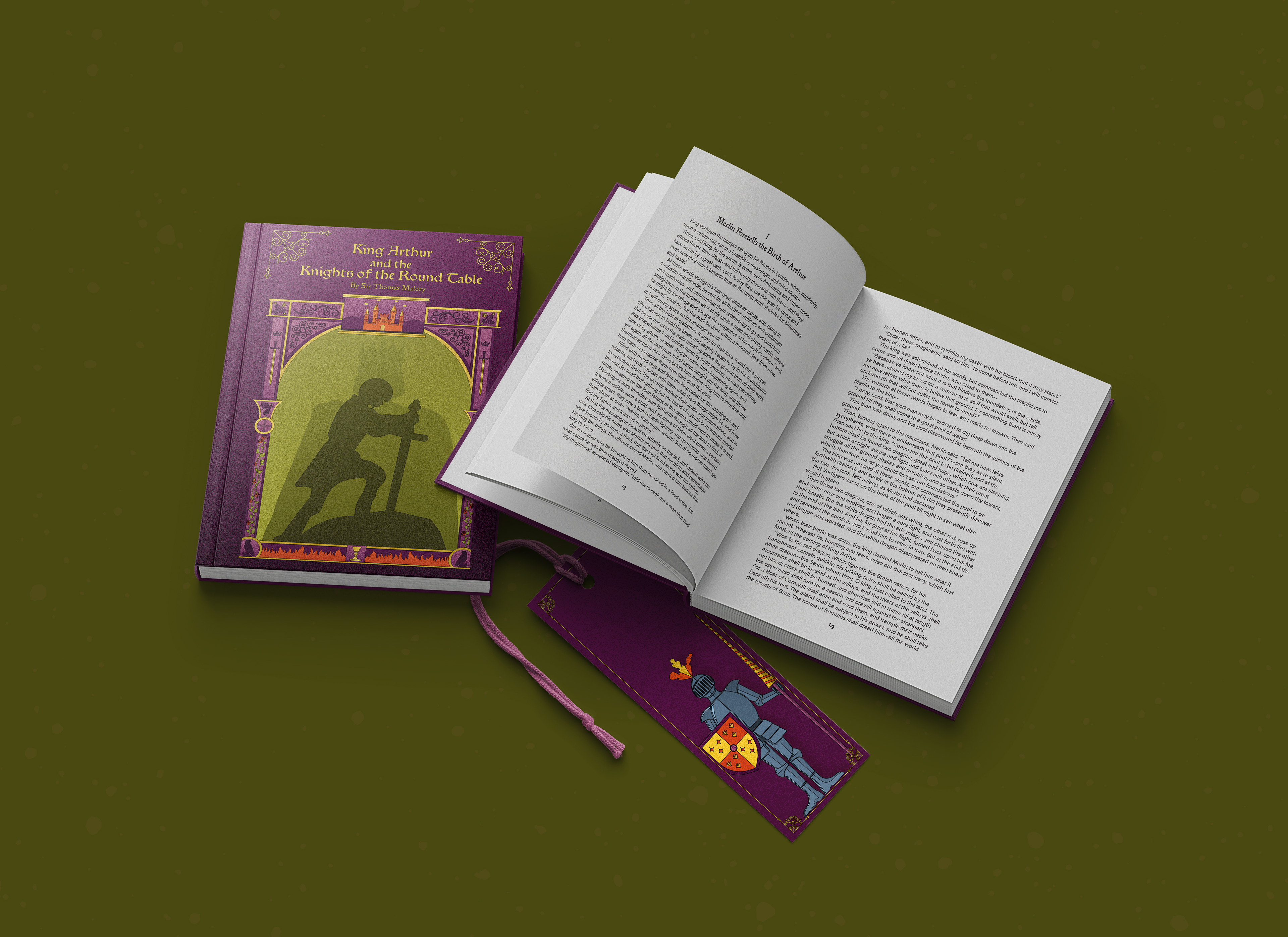
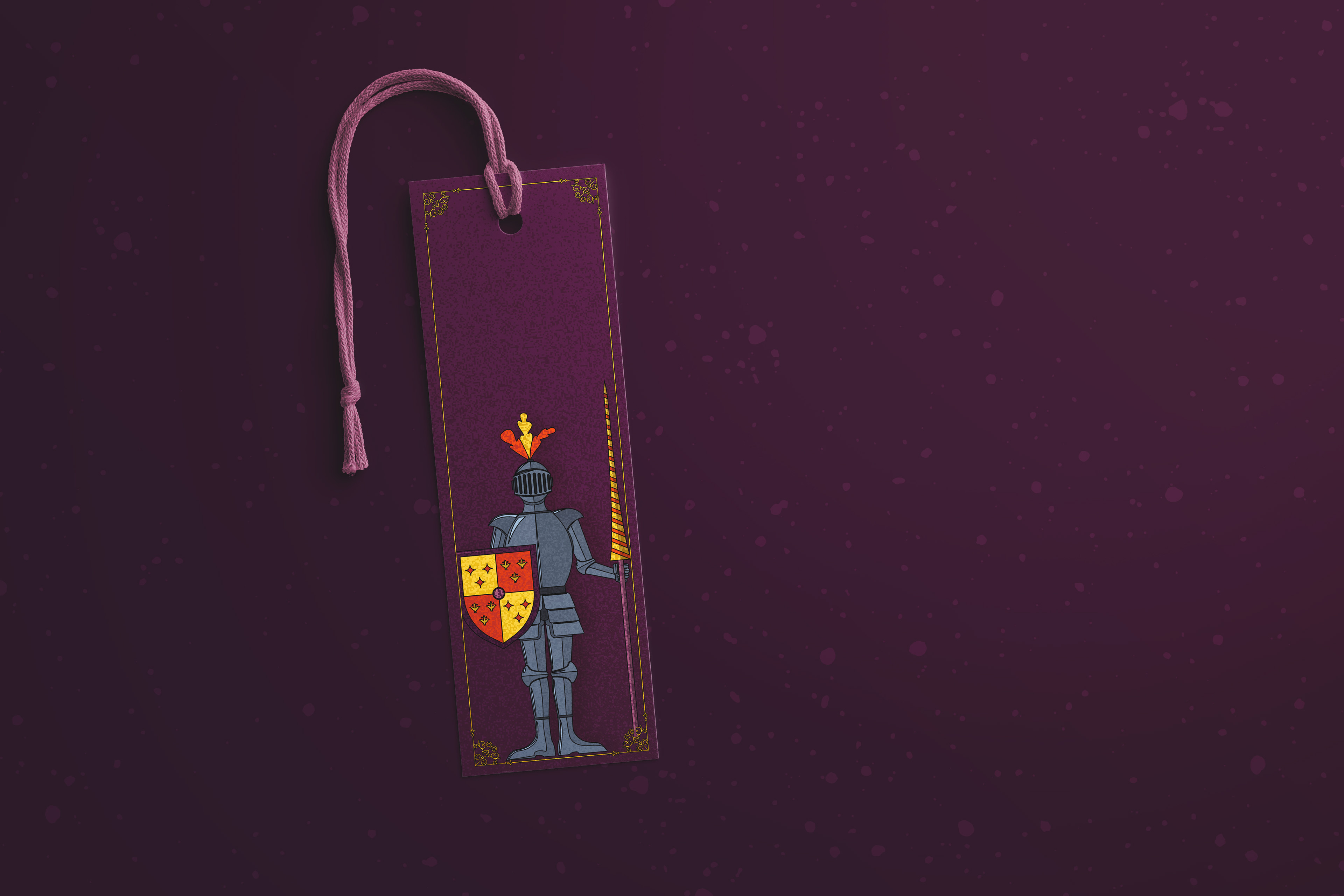
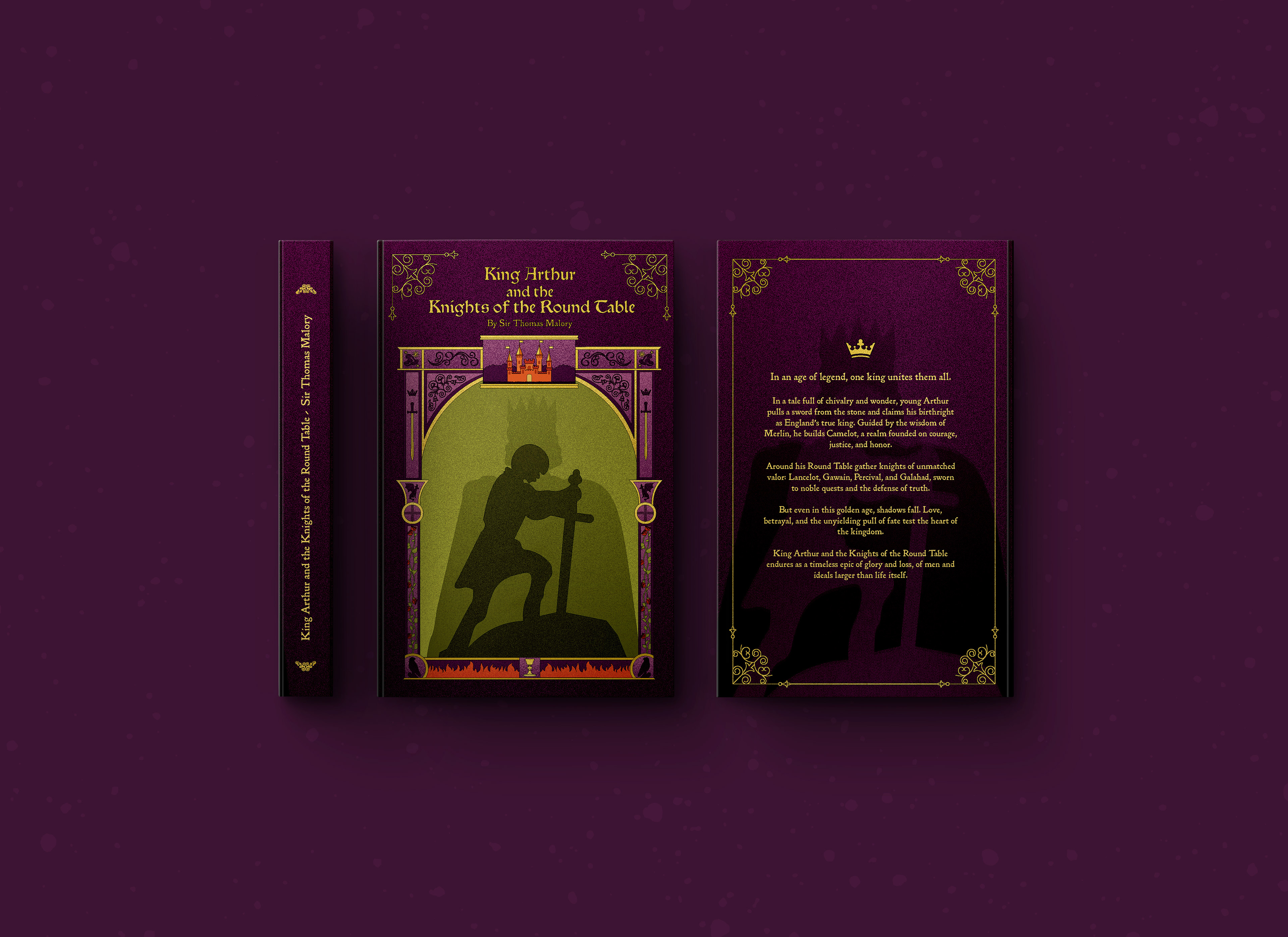
This redesign captures the grandeur and mythology of the Arthurian world through castle-inspired framing and layered symbolism. Camelot sits at the center, surrounded by motifs of peace, destiny, and chivalry. A rich, dark palette—purple for royalty, yellow for wealth, orange for discord, and green for harmony—reflects the balance Arthur strives to maintain within Camelot and the beauty of its eventual fall.
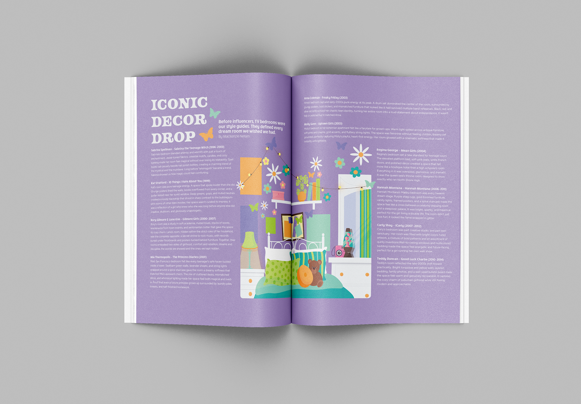
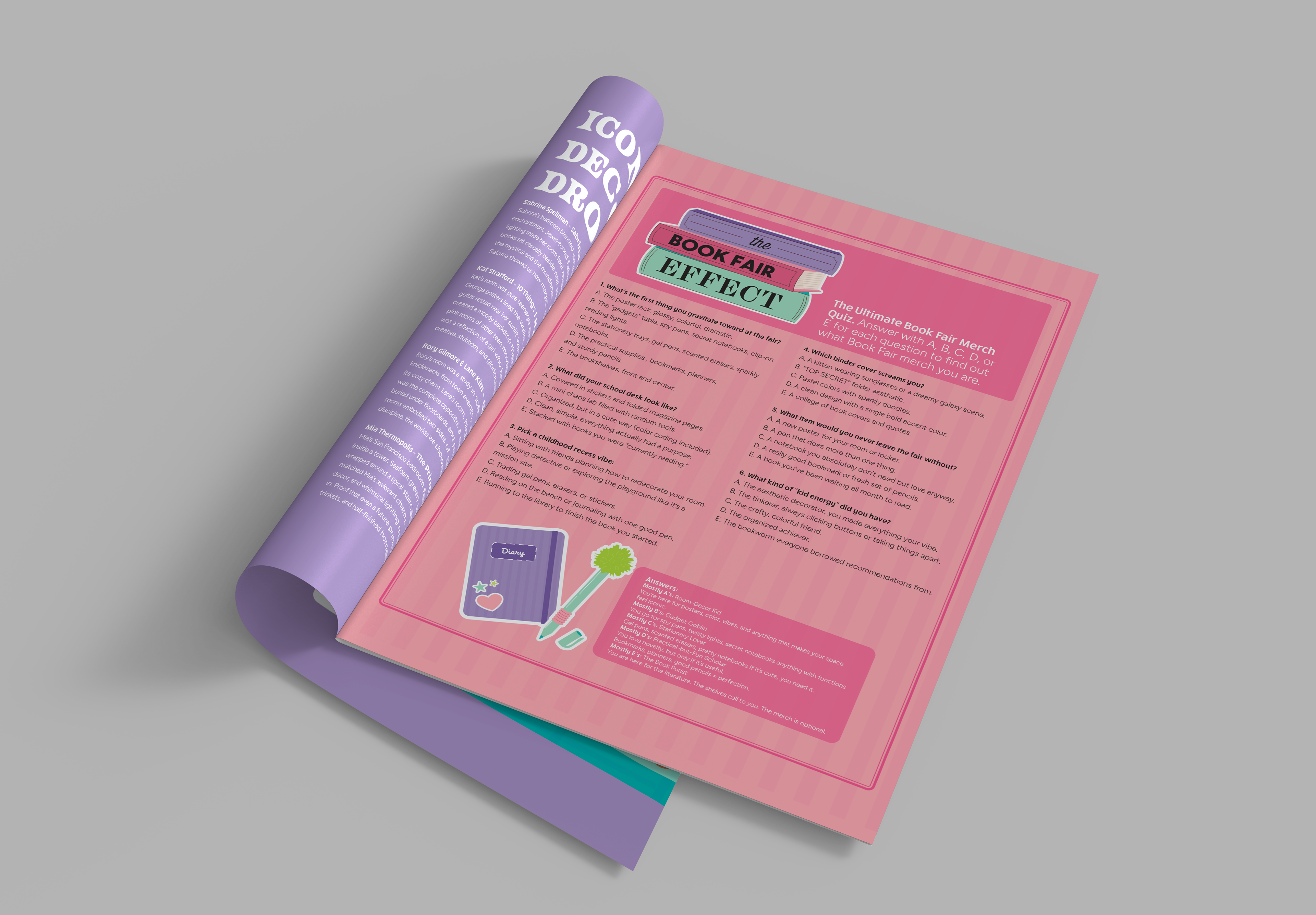
I wrote and illustrated articles, including features on 2000s dream bedrooms and a Y2K quiz, adding a playful Scholastic Book Fair twist. This project strengthened my skills in layout design, illustration, and collaborative creative work. I also contributed to the branding team by turning classmate-created assets into polished layouts and assisted with photo editing and cover critique.